Establishing a recognizable identity
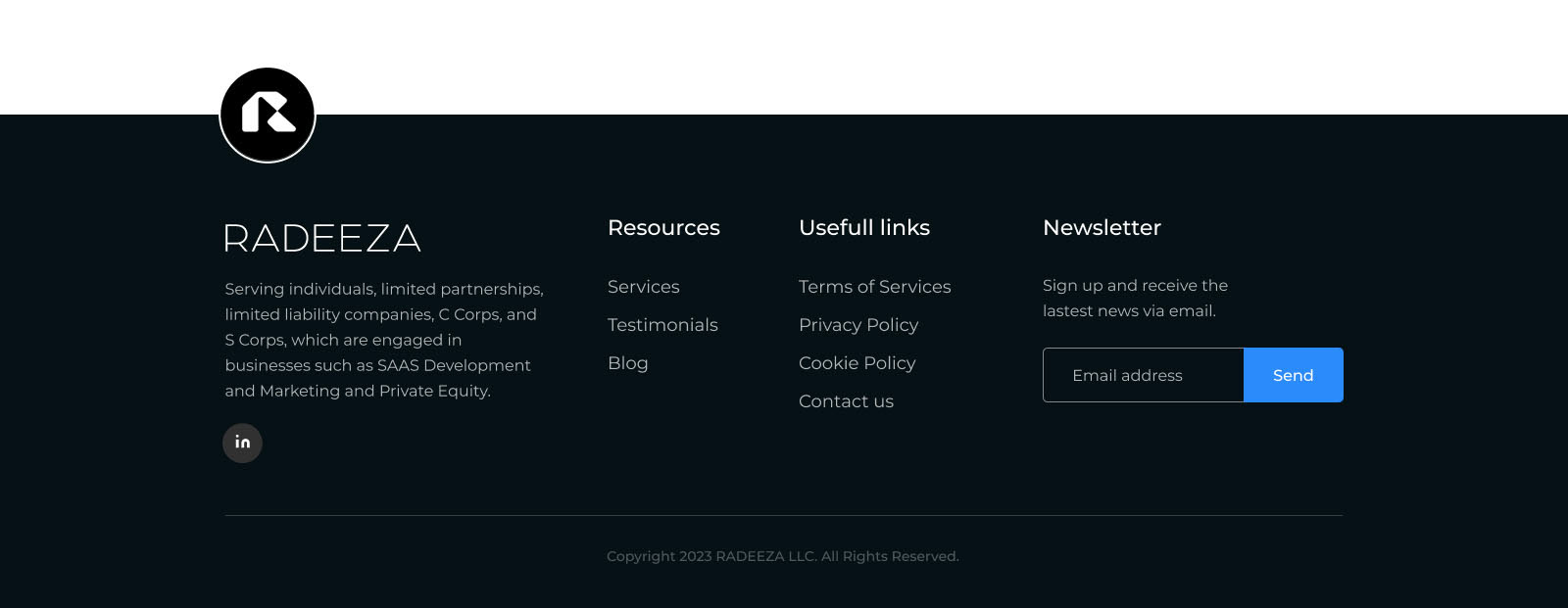
The geometric symbol and restrained wordmark give RADEEZA a compact, recognizable signature. Across the website, blue establishes the main brand presence, while orange accents highlight services and selected calls to action.

Introducing the business clearly
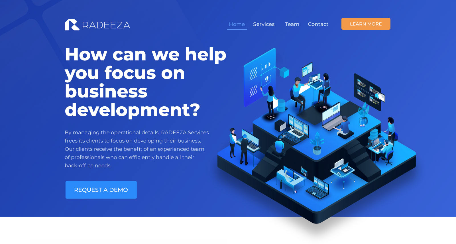
The website leads with RADEEZA’s central benefit: giving clients more time to focus on their business. A direct headline, supporting illustration, and prominent call to action introduce the service before moving into the operational details.

Defining a consistent visual language
I developed the identity around four attributes: powerful, progressive, stable, and precise. The guidelines define the relationship between the wordmark, horizontal lockup, and standalone symbol, including clear space and optical alignment.
Montserrat establishes the typographic hierarchy, while supporting blues, orange, and neutral tones extend the black-and-white identity into digital communications.


Making the services easier to navigate
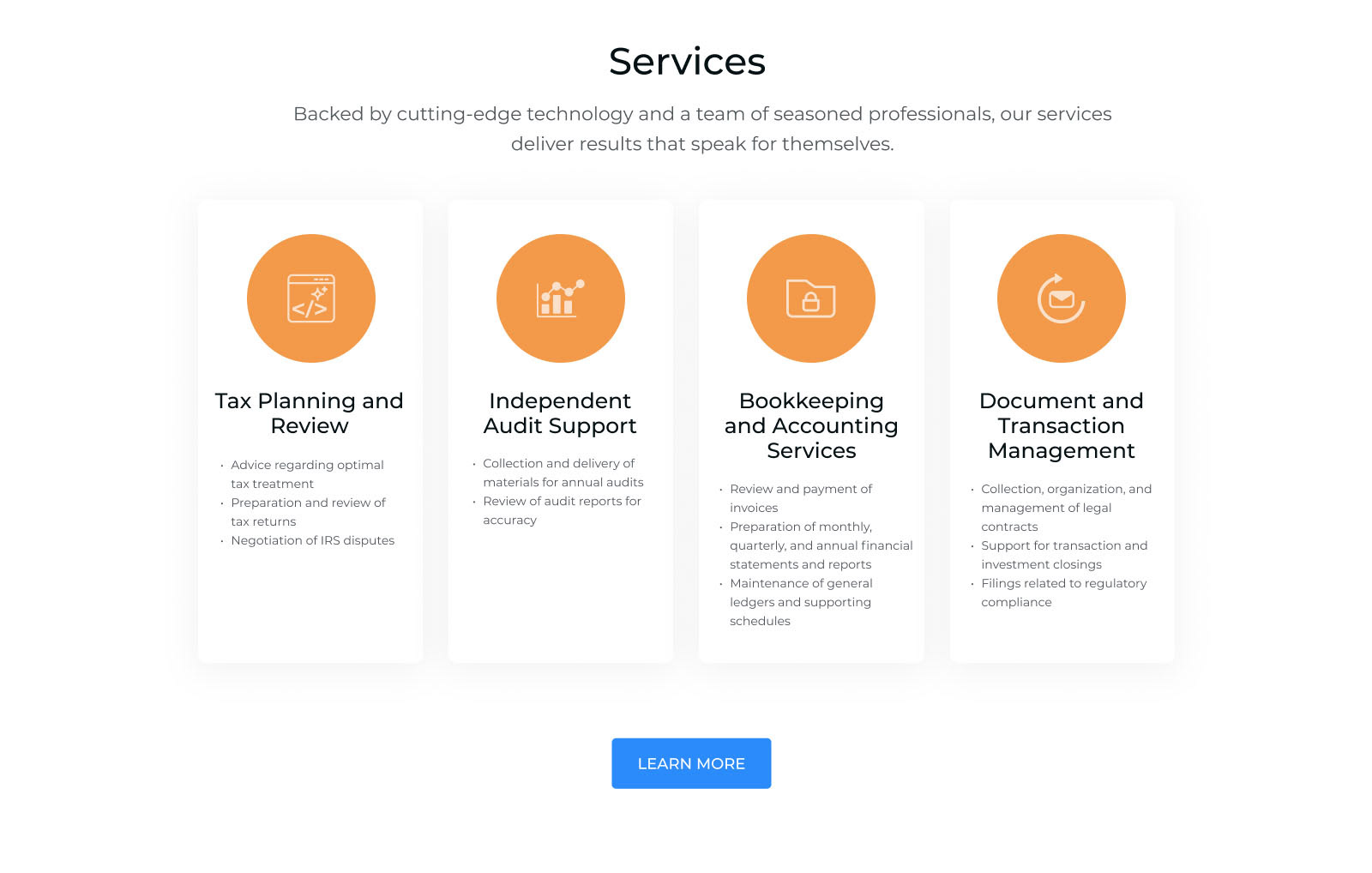
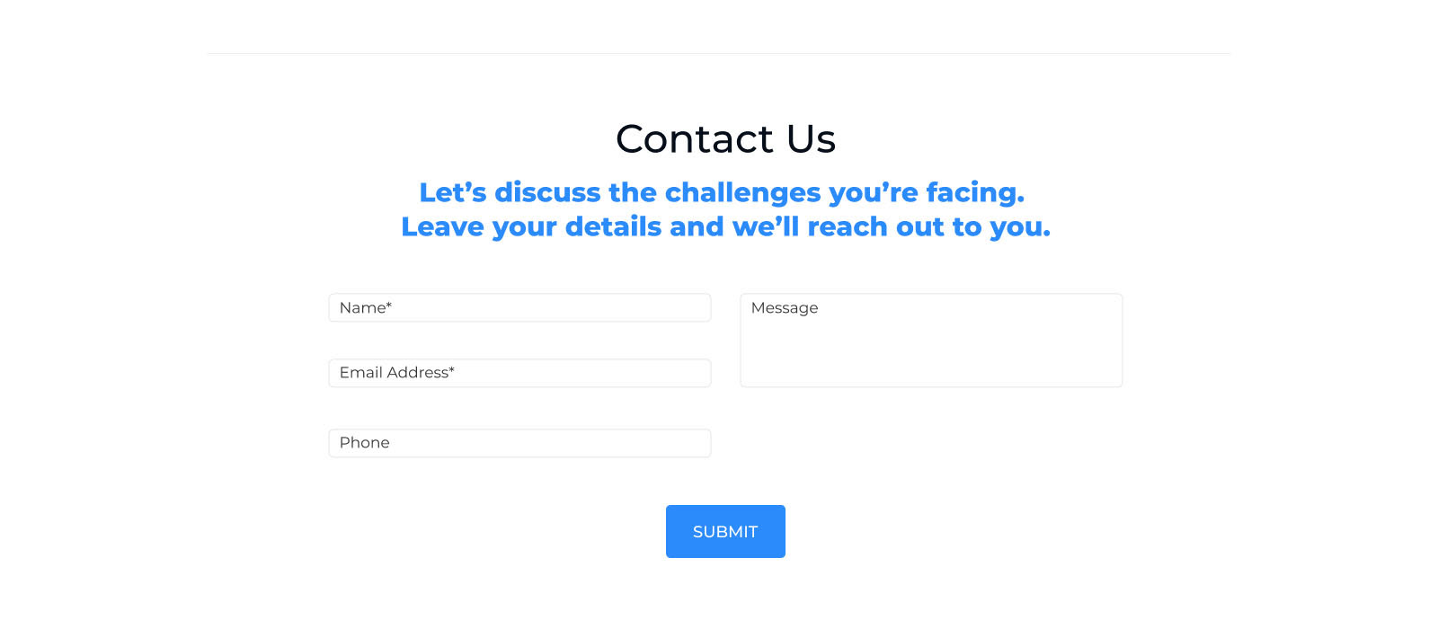
The page organizes RADEEZA’s offering into four service categories, using consistent cards, icons, and headings to make the information easier to scan. Supporting sections explain who the business serves and give prospective clients a clear next step.